Chapter 4 - Describing Relationships
4.1 What Is a Relationship?
For most research questions, we are not just interested in the distribution of a single variable.56 Get lost, Chapter 3, nobody likes you. Instead, we are interested in the relationship we see in the data between two or more variables.
What does it mean for two variables to have a relationship? The relationship between two variables shows you what learning about one variable tells you about the other.
For example, take height and age among children. Generally, the older a child is, the taller they are. So, learning that one child is thirteen and another is six will give you a pretty good guess as to which of the two children is taller.
We can call the relationship between height and age positive, meaning that for higher values of one of the variables, we expect to see higher values of the other, too (more age is associated with more height). There are also negative relationships, where higher values of one tend to go along with lower values of the other (more age is associated with less crying). There are also null relationships where the variables have nothing to do with each other (older children aren’t any more or less likely to live in France than younger children). All kinds of other relationships are positive sometimes and negative other times, or really positive at first and then only slightly positive later. Or perhaps one of the variables is categorical and there’s not really a “higher” or “lower,” just “different” (older children are more likely to use a bike for transportation than younger children). Lots of options here.
The goal in this chapter is to figure out how to describe the relationship between two variables, so that we can accurately relay what we see in the data about our research question, which, once again, very likely has to do with the relationship between two variables. Once we know how to describe the relationship we see in the data, we can work in the rest of the book to make sure that the relationship we’ve described does indeed answer our research question.
Throughout this chapter, we’re going to use some example data from a study by Emily Oster (2020bOster, Emily. 2020b. “Health Recommendations and Selection in Health Behaviors.” American Economic Review: Insights 2 (2): 143–60.), who used the National Health and Nutrition Examination Survey. Her research question was: do the health benefits of recommended medications look better than they actually are because already-otherwise-healthy people are more likely to follow the recommendations?
To study this question, she looked at vitamin E supplements, which were only recommended for a brief period of time. She then answers her research question by examining the relationship between taking vitamin E, other indicators of caring about your health like not smoking, and outcomes like mortality, and how those relationships change before, during, and after the time vitamin E was recommended.57 In this chapter, I’ll add some analyses that weren’t exactly in the original study but are in the same spirit, wherever it helps explain how to describe relationships. It’s almost like she had other purposes for her study besides providing good examples for my textbook. Rude if you ask me.
Scatterplot. A graph that plots every data point for an \(x\)-axis variable and a \(y\)-axis variable.
We can start off with an example of a very straightforward way of showing the relationship between two continuous variables, which is a scatterplot, as shown in Figure 4.1. Scatterplots simply show you every data point there is to see. They can be handy for getting a good look at the data and trying to visualize from them what kind of relationship the two variables have. Does the data tend to slope up? Does it slope down a lot? Or slope down just a little like in Figure 4.1? Or go up and down?
Figure 4.1: Age and Heart Health, 150 Observations
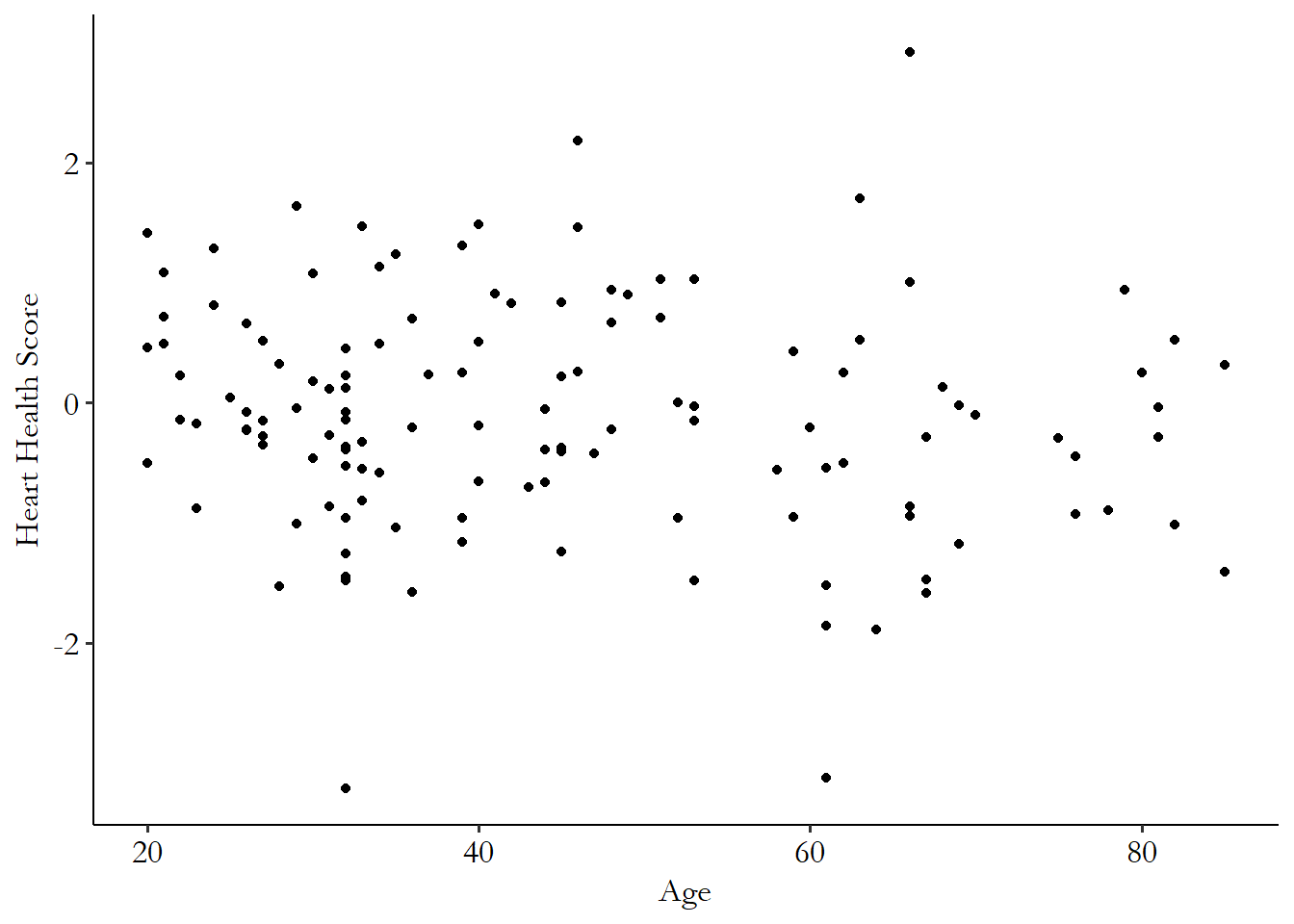
A scatterplot is a basic way to show all the information about a relationship between two continuous variables, like the density plots were for a single continuous variable in Chapter 3.58 Unlike density plots, though, they tend to get very hard to read if you have a lot of data. That’s why I only used 150 observations for that graph, not all of them. And they’re usually a great place to start describing a relationship.
Scatterplots imply two things beyond what they actually show. One is bad, and one is good. The bad one is that it’s very tempting to look at a relationship in a scatterplot and assume that it means that the \(x\)-axis causes the \(y\)-axis. Even if we know that’s not true, it’s very tempting. The good one is that it encourages us to use the scatterplot to imagine other ways of describing the relationship that might give us the information we want in a more digestible way. That’s what the rest of this chapter is about.
4.2 Conditional Distributions
Last chapter was all about describing the distributions of variables. The distributions in that chapter are called unconditional distributions.59 These are also called “marginal” distributions, but I really dislike this term, as I think it sounds like the opposite of what it means.
Conditional distribution. The distribution of a variable conditional on another variable taking a certain value.
A conditional distribution is the distribution of one variable given the value of another variable.
Let’s start with a more basic version - conditional probability. The probability that someone is a woman is roughly 50%. But the probability that someone who is named Sarah is a woman is much higher than 50%. You can also say “among all Sarahs, what proportion are women?” We would say that this is the “probability that someone is a woman conditional on being named Sarah.”
Learning that someone is named Sarah changes the probability that we can place on them being a woman. Conditional distributions work the same way, except that this time, instead of just a single probability changing, an entire distribution changes.
Take Figure 4.2 for example. In this graph, we look at the distribution of how much vitamin E someone takes, among people who take any. We then split out the distribution by whether someone has engaged in vigorous exercise in the last month.
Figure 4.2: Distribution of Amount of Vitamin E Taken by Exercise Level
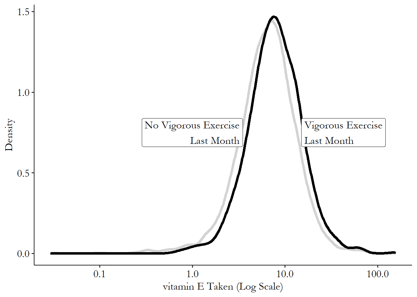
We can see a small shift in the distribution between those who exercise and those who don’t.60 It doesn’t look enormous, but this is actually how a lot of fairly prominent differences look in the social sciences. That rightward shift can be deceptively larger than it looks! In particular, those who exercise vigorously take larger doses of vitamin E when they take it. The distribution is different between exercisers and non-exercisers, telling us that vitamin E and exercise are related to each other in this data.
The example I’ve given is for a continuous variable, but it works just as well for a categorical variable. Instead of looking at how large the doses are, let’s look at whether someone takes vitamin E at all! Oster’s hypothesis is that people who take vitamin E at all should be more likely to do other healthy things like exercise, because both are driven by how health-conscious they are.
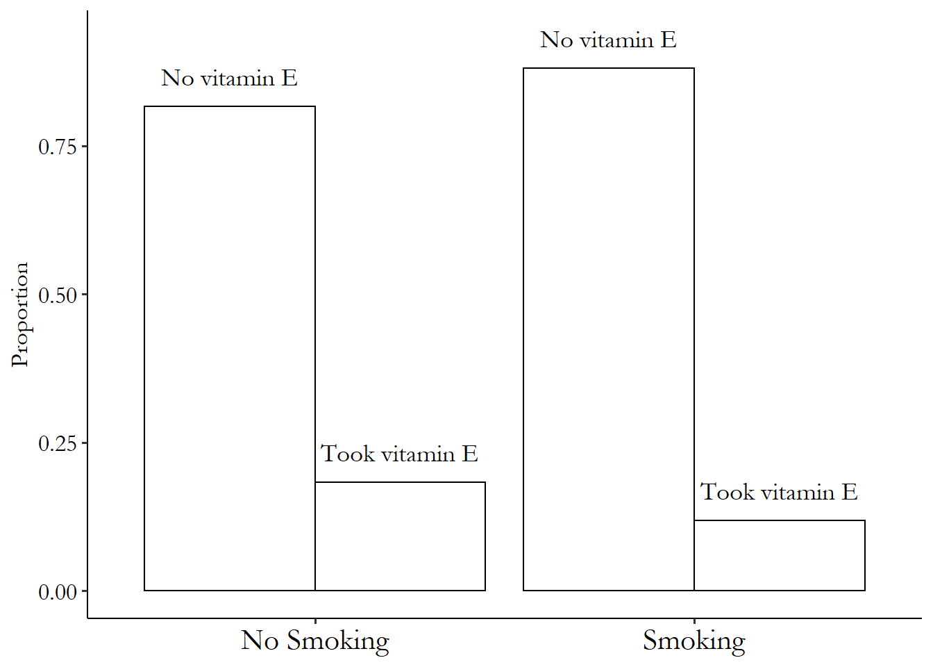
Figure 4.3 shows an example of this. The distribution of whether you take vitamin E or not is shown twice here, once for those who currently smoke, and one for those who don’t smoke. The distributions are clearly different, with a higher proportion taking vitamin E in the non-smoking crowd, exactly what Oster would expect.
Figure 4.3: Distribution of Whether Vitamin E is Taken by Whether you Smoke
4.3 Conditional Means
Conditional mean. The mean of one variable given that another variable takes a certain value.
With the concept of a conditional distribution under our belt, it should be clear that we can then calculate any feature of that distribution conditional on the value of another variable. What’s the 95th percentile of vitamin E taking overall and for smokers? What’s the median? What’s the standard deviation of mortality for people who take 90th-percentile levels of vitamin E, and for people who take 10th-percentile levels?
While all those possibilities remain floating in the air, we will focus on the conditional mean. Given a certain value of \(X\), what do we expect the mean of \(Y\) to be?61 Why the mean? One reason is that the mean behaves a bit better in small samples, and once we start looking at things separately by specific values of \(X\), samples get small. Another reason is that it helps us weight prediction errors and so figure out how to minimize those errors. It’s just handy.
Once we have the conditional mean, we can describe the relationship between the two variables fairly well. If the mean of \(Y\) is higher conditional on a higher value of \(X\), then \(Y\) and \(X\) are positively related. Going further, we can map out all the conditional means of \(Y\) for each value of \(X\), giving us the full picture on how the mean of one variable is related to the values of the other.
In some cases, this is easy to calculate. If the variable you are conditioning on is discrete (or categorical), you can just calculate the mean for all observations with that value. See Figure 4.4, for example, which shows the proportion taking vitamin E conditional on whether the observations are from before vitamin E was recommended, during recommendation, or after.62 “Proportion” is the mean of a binary variable. I just took all the observations in the data from before the recommendation and calculated the proportion who took vitamin E. Then I did the same for the data during the recommendation, and after the recommendation.
Figure 4.4: Proportion Taking Vitamin E Before It Was Recommended, During, and After
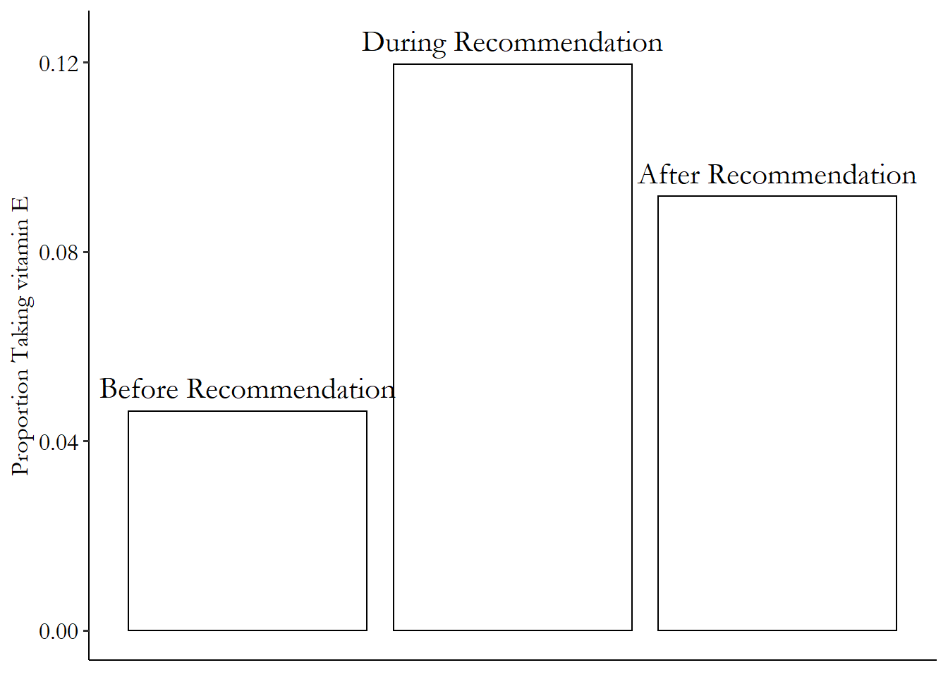
Figure 4.4 shows the relationship between taking vitamin E and the timing of the recommendation. We can see that the relationship between taking vitamin E and the recommendation being in place is positive (the proportion taking vitamin E is higher during the recommendation time). We also see that the relationship between vitamin E and time is at first positive (increasing as the recommendation goes into effect) and then negative (decreasing as the recommendation is removed).
Things get a little more complex when you are conditioning on a continuous variable. After all, I can’t give you the proportion taking vitamin E among those making $84,325 per year because there’s unlikely to be more than one person with that exact number. Lots of numbers would have nobody at all to take the mean over!
There are two approaches we can take here. One approach is to use a range of values for the variable we’re conditioning on rather than a single value. Another is to use some sort of shape or line to fill in those gaps with no observations.
Let’s focus first on using a range of values. Table 4.1 shows the proportion of people taking vitamin E conditional on body mass index (BMI). Since BMI is continuous, I’ve cut it up into ten equally-sized ranges (bins) and calculated the proportion taking vitamin E within each of those ranges. Cutting the data into bins to take a conditional mean isn’t actually done that often in real research, but it gives a good intuitive sense of what we’re trying to do when we use other methods later.
Table 4.1: Proportion Taking Vitamin E by Range of Body Mass Index Values
| BMI Bin | Proportion Taking vitamin E |
|---|---|
| (11.6,20.6] | 0.133 |
| (20.6,29.5] | 0.159 |
| (29.5,38.4] | 0.171 |
| (38.4,47.3] | 0.178 |
| (47.3,56.2] | 0.203 |
| (56.2,65.1] | 0.243 |
| (65.1,74] | 0.067 |
| (74,83] | 0.143 |
Those same ranges can be graphed, as in Figure 4.5. The flat lines reflect that we are assigning the same mean to every observation in that range of BMI values. They show the mean conditional on being in that BMI bin. We see from this that BMI has a positive relationship with taking vitamin E up until the 70+ ranges, at which point the conditional mean drops.
Figure 4.5: Proportion Taking Vitamin E by Range of Body Mass Index Values
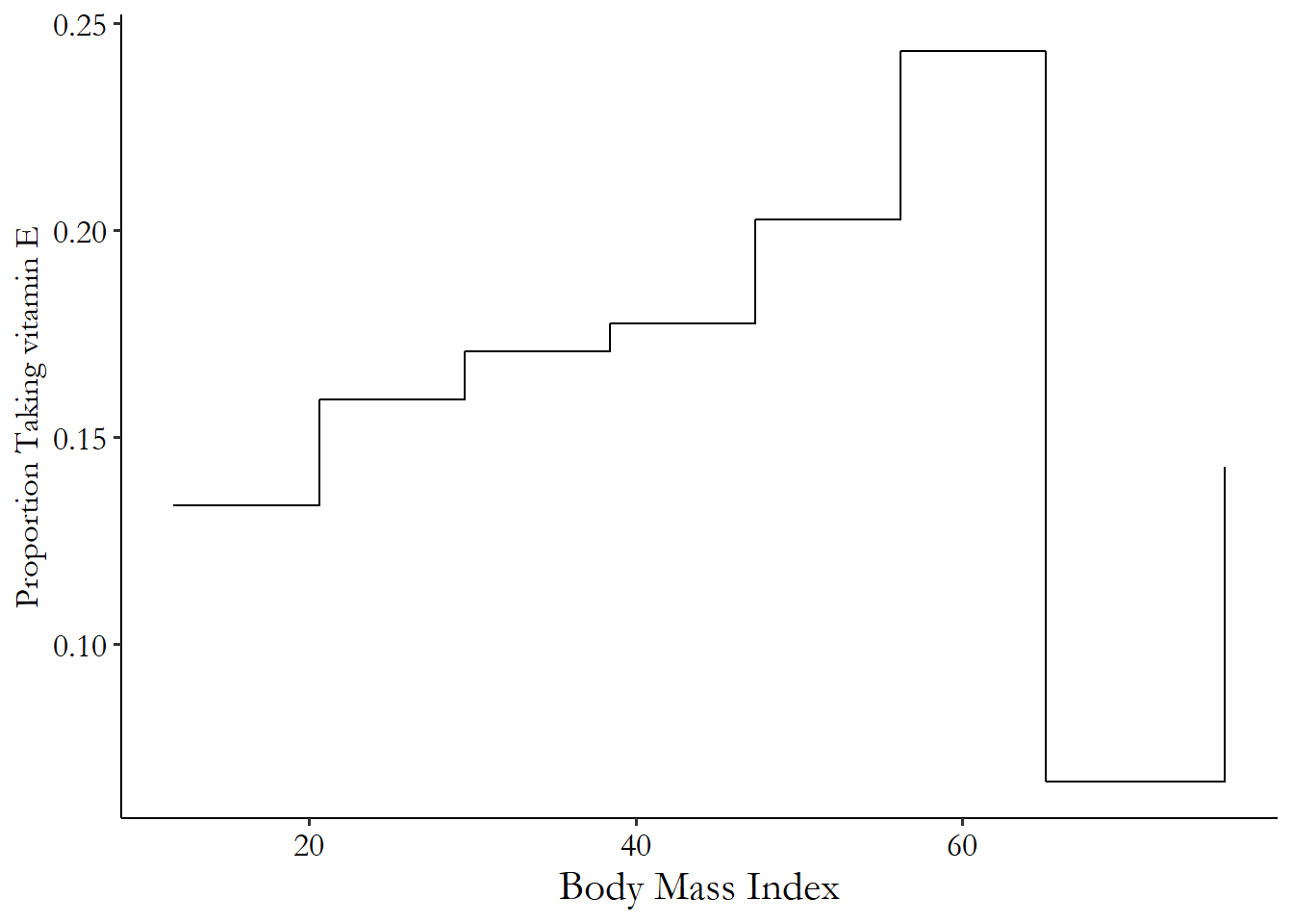
Of course, while this approach is simple and illustrative, it’s also fairly arbitrary. I picked the use of ten bins (as opposed to nine, or eleven, or…) out of nowhere. It’s also arbitrary to use evenly sized bins; no real reason I had to do that. Plus, it’s rather choppy. Do I really think that if someone is at the very top end of their bin, they’re more like someone at the bottom of their bin than like the person at the very bottom end of the next bin?
Local mean. The mean of a variable \(Y\) calculated using only observations over a short range of another variable \(X\).
Instead, we can use a range of \(X\) values to get conditional means of \(Y\) using local means. That is, to calculate the conditional mean of \(Y\) at a value of, say, \(X = 2.5\), we take the mean of \(Y\) for all observations with \(X\) values near 2.5. There are different choices to make here - how close do you have to be? Do we count you equally if you’re very close vs. kind of close?
A common way to do this kind of thing is with a LOESS curve,63 “Locally Estimated Scatterplot Smoothing” also known as LOWESS.64 Depending on who you ask, LOESS and LOWESS might be the exact same thing, or might have slight differences in how they estimate their local prediction, with either name referring to either of the local-prediction variants. LOESS provides a local prediction, which it gets by fitting a different shape for each value on the \(X\) axis, with the estimation of that shape weighting very-close observations more than kind-of close observations. The end result is nice and smooth.
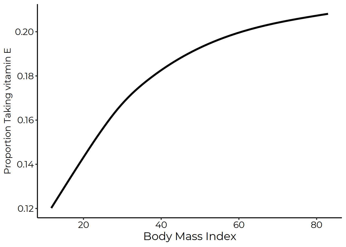
Figure 4.6 shows the LOESS curve for the proportion taking vitamin E and BMI.
Figure 4.6: Proportion Taking Vitamin E by BMI with a LOESS Curve
LOESS. A curve that uses local averages to smooth out the relationship between two variables.
From Figure 4.6 we can see a clear relationship, with higher values of BMI being associated with more people taking vitamin E. The relationship is very strong at first, but then flattens out a bit, although it remains positive.65 Why doesn’t this dip down at the end like Figure 4.5? There are very, very few observations in those really-high BMI bins. LOESS doesn’t let that tiny number of observations pull it way down, and so sort of ignores them in a way that Figure 4.5 doesn’t. It got there by just calculating the proportion of people taking vitamin E among those who have BMIs in a certain range, with “a certain range” moving along to the right only a bit at a time while it constructed its conditional means.
4.4 Line-fitting
Showing the mean of \(Y\) among local values of \(X\) is valuable, and can produce a highly detailed picture of the relationship between \(X\) and \(Y\). But it also has limitations. There still might be gaps in your data it has trouble filling in, for one. Also, it can be hard sometimes to concisely describe the relationship you see.66 Not to mention, it can be difficult, although certainly not impossible, to do what we do in the Conditional Conditional Means section with those methods.
Regression. The practice of fitting a shape, usually a line, to describe the relationship between two variables.
Enter the concept of line-fitting, also known as regression.67 These two concepts are not the exact same thing, really. But they’re close enough in most applications. Also, while I repeatedly mention conditional means in this section, there are versions of line-fitting that give conditional medians or percentiles or what-have-you as well.
Instead of thinking locally and producing estimates of the mean of \(Y\) conditional on values of \(X\), we can assume that the underlying relationship between \(Y\) and \(X\) can be represented by some sort of shape. In basic forms of regression, that shape is a straight line. For example, the line
tells us that the mean of \(Y\) conditional on, say, \(X = 5\) is \(3 + 4(5) = 23\). It also tells us that the mean of \(Y\) conditional on a given value of \(X\) would be \(4\) higher if you instead made it conditional on a value of \(X\) one unit higher.
In Figure 4.7, we repeat the vitamin E/BMI relationship from before but now have a straight line fit to it. That particular straight line has a slope of .002, telling us that you are .2 percentage points more likely to take a vitamin E supplement than someone with a BMI one unit lower than you.
Figure 4.7: Proportion Taking Vitamin E by BMI with a Fitted Straight Line
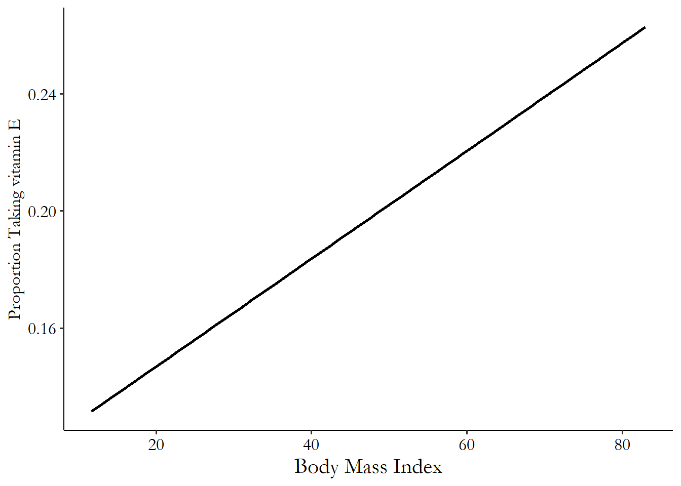
This approach has some real benefits. For one, it gives us the conditional mean of \(Y\) for any value of \(X\) we can think of, even if we don’t have data for that specific value.68 Although if we don’t have data anywhere near that value, we probably shouldn’t be trying to get the conditional mean there. Also, it lets us very cleanly describe the relationship between \(Y\) and \(X\). If the slope coefficient on \(X\) (.002 in the vitamin E/BMI regression) is positive, then \(X\) and \(Y\) are positively related. If it’s negative, they’re negatively related.
Those are pragmatic upsides for using a fitted line. There are more upsides in statistical terms in using a line-fitting procedure to estimate the relationship. Since the line is estimated using all the data, rather than just local data, the results are more precise. Also, the line can be easily extended to include more than one variable (more on that in the next section).
There is a downside as well, of course. The biggest downside is that fitting a line requires us to fit a line. We need to pick what kind of shape the relationship is - a straight line? A curved line? A line that wobbles up and down and up and down? The line-fitting procedure will pick the best version of the shape we give it. But if the shape is all wrong to start with, our estimate of the conditional mean will be all wrong. Imagine trying to describe the relationship in Figure 4.6 using a straight line!
The weakness here isn’t necessarily that straight lines aren’t always correct - line-fitting procedures will let us use curvy lines. But we have to be aware ahead of time that a curvy line is the right thing to use, and then pick which kind of curvy line it is ahead of time.
That weakness is, naturally, set against the positives, which are strong enough that line-fitting is an extremely common practice across all applied statistical fields. So, then, how do we do it?
Ordinary least squares. A regression method that uses a straight line and minimizes the sum of squared residuals.
Ordinary Least Squares (OLS) is the most well-known application of line-fitting. OLS picks the line that gives the lowest sum of squared residuals. A residual is the difference between an observation’s actual value and the conditional mean assigned by the line.69 Or if you prefer, the difference between the actual value and the prediction.
Take that \(Y = 3 + 4X\) line I described earlier. We determined that the conditional mean of \(Y\) when \(X = 5\) was \(3 + 4(5) = 23\). But what if we see someone in the data with \(X = 5\) and \(Y = 25\)? Well then their residual is \(25 - 23 = 2\). OLS takes that number, squares it into a \(4\), then adds up all the predictions across all your data. Then it picks the values of \(\beta_0\) and \(\beta_1\) in the line \(Y = \beta_0 + \beta_1X\) that make that sum of squared residuals as small as possible, as in Figure 4.8.
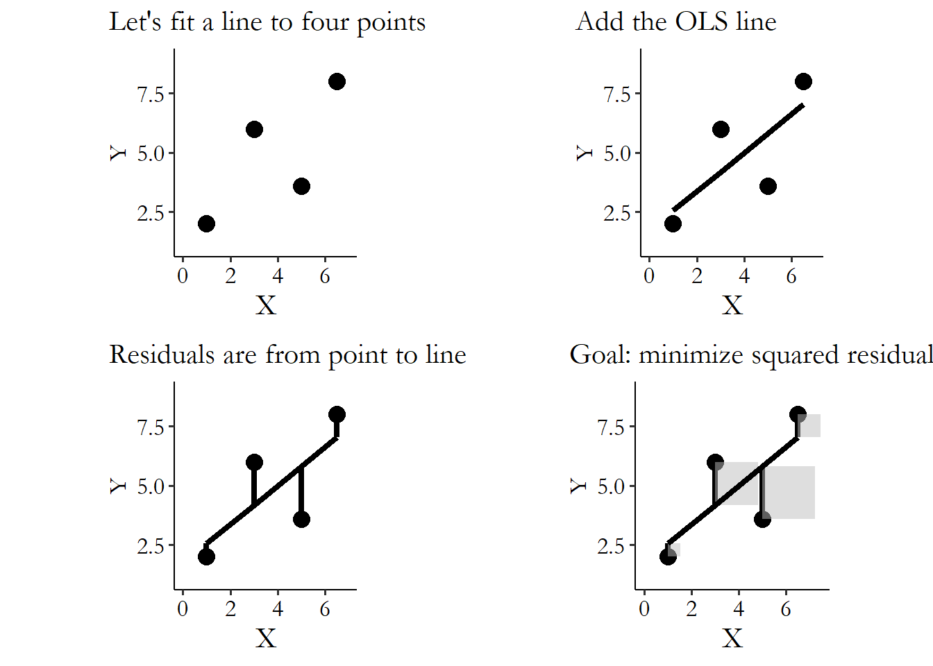
Figure 4.8: Fitting an OLS Line to Four Points
How does it do this?70 Calculus, for one. But besides that. It takes advantage of information about how the two variables move together or apart, encoded in the covariance.
If you recall the variance from Chapter 3, you’ll remember that to calculate the variance of \(X\), we: (a) subtracted the mean of \(X\) from \(X\), (b) squared the result, (c) added up the result across all the observations, and (d) divided by the sample size minus one. The resulting variance shows how much a variable actually varies.
The covariance is the exact same thing, except that in step (a) you subtract the mean from two separate variables, and in step (b) you multiply the result from one variable by the result from the other. The resulting covariance shows how much two variables move together or apart. If they tend to be above average at the same time or below average at the same time, then multiplying one by the other will produce a positive result for most observations, increasing the covariance. If they have nothing to do with each other, then multiplying one by the other will give a positive result about half the time and a negative result the other half, canceling out in step (c) and give you a covariance of \(0\).
Covariance. A measurement of how much two variables vary with each other, as opposed to how much a single variable varies as in the variance. Technically, the average of the summed products of de-meaned variables.
How does OLS use covariance to get the relationship between \(Y\) and \(X\)? It just takes the covariance and divides it by the variance of \(X\), i.e., \(cov(X,Y)/var(X)\). That’s it!71 This is for the two-variable version. We’ll get to more complex ones in a bit. This is roughly saying “of all the variation in \(X\), how much of it varies along with \(Y\)?”72 The sheer intuitive nature of this calculation might give a clue as to why we focus on minimizing the sum of squared residuals rather than, say, the residuals to the fourth power, or the product, or the sum of the absolute values. OLS gets some flak in some statistical circles for being restrictive, or for some of its assumptions. But the way that it seems to pop up everywhere and be linked to everything - it’s the \(\pi\) of statistical methods, if you ask me. I could write a whole extra chapter just on cool stuff going on under the hood of OLS. Look at me, starstruck over a ratio. Then, once it has its slope, it picks an intercept for the line that makes the mean of the residuals (not the squared residuals) \(0\), i.e., the conditional mean is at least right on average.
The result from OLS is then a line with an intercept and a slope like \(Y = 3 + 4X\). You can plug in a value of \(X\) to get the conditional mean of \(Y\). And, crucially, you can describe the relationship between the variables using the slope. Since the line has \(4X\) in it, we can say that a one-unit increase in \(X\) is associated with a four-unit increase in \(Y\).
Correlation. A measurement of how two variables vary linearly together or apart, scaled to be between \(-1\) and \(1\).
Sometimes we may find it useful to rescale the OLS result. This brings us to the concept of correlation. Correlation, specifically Pearson’s correlation coefficient, takes this exact concept and just rescales it, multiplying the OLS slope by the standard deviation of \(X\) and dividing it by the standard deviation of \(Y\). This is the same as taking the covariance between \(X\) and \(Y\) and dividing by both the standard deviation of \(X\) and the standard deviation of \(Y\).
The correlation coefficient also relies on this concept of fitting a straight line. It just reports the result a little differently. We lose the ability to interpret the slope in terms of the units of \(X\) and \(Y\).73 Why? Well, the slope of a straight line tells you the change in units-of-\(Y\)-per-units-of-\(X\). You can read that “per” as “divided by.” When we multiply by the standard deviation of \(X\), that’s in units of \(X\), so the units cancel out with the per-units-of-X, leaving us with just units-of-Y. Then when we divide by the standard deviation of \(Y\), that’s in units of \(Y\), canceling out with units-of-\(Y\) and leaving us without any units. However, we gain the ability to more easily tell how strong the relationship is. The correlation coefficient can only range from \(-1\) to \(1\), and the interpretation is the same no matter what units the original variables were in. The closer to \(-1\) it is, the more strongly the variables move in opposite directions (downward slope). The closer to \(1\) it is, the more strongly the variables move in the same direction (upward slope).
How about for vitamin E and BMI? OLS estimates the line
and selects the best-fit values of \(\beta_1\) and \(\beta_2\) to give us
Regression slope coefficient. The linear relationship between two variables, estimated by regression. A one-unit change in one variable is associated with a (coefficient)-unit change in the other.
So for a one-unit increase in BMI, we’d expect a .002 increase in the conditional mean of vitamin E. Since vitamin E is a binary variable, we can think of a .002 increase in conditional mean as being a .2 percentage point increase in the proportion of people taking vitamin E.
Then, since the standard deviation of taking vitamin E is .369 and the standard deviation of BMI is 6.543, the Pearson correlation between the two is \(.002\times 6.543 / .369 = .355\).
Sometimes being straight is insufficient. OLS fits a straight line, but many sets of variables do not have a straight-line relationship! In fact, as shown in Figure 4.6, our vitamin E/BMI relationship is one of them. What to do?
Two heroes come to our rescue.74 These are two heroes that will not really receive the attention necessary in this book, which in general covers regression just enough to get to the research design. See a little more in Chapter 13, or check out a more dedicated book on regression like Real Econometrics by Bailey (2019Bailey, Michael A. 2019. Real Econometrics. Oxford University Press.).
The first of them is apparently also the villain, OLS. Turns out OLS doesn’t actually have to fit a straight line. Haha, gotcha. It just needs to fit a line that is “linear in the coefficients,” meaning that the slope coefficients don’t have to do anything wilder than just being multiplied by a variable.
Asking it to estimate the \(\beta\) values in \(Y = \beta_0 + \beta_1X\) is fine, as before. But so is \(Y = \beta_0 + \beta_1X + \beta_2X^2\) - not a straight line! Or \(Y = \beta_0 + \beta_1\ln(X)\) - also not a straight line! And so on. What would be something that’s not linear in coefficients? That would be something like \(Y = \beta_0 + X^{\beta_1}\) or \(Y = \frac{\beta_0}{1+\beta_1X}\).
So that scary-looking curved line in Figure 4.6? Not a problem, actually. As long as we take a look at our data beforehand to see what kind of shape makes sense (do we need a squared term for a parabola? Do we need a log term to rise quickly and then level out?), we can mimic that shape. For Figure 4.6 we could probably do with \(Y = \beta_0 + \beta_1X + \beta_2X^2\) to get the nice flexibility of the LOESS with the OLS bonuses of having fit a shape.
The second hero is “nonlinear regression” which can take many, many forms. Often it is of the form \(Y = F(\beta_0 + \beta_1X)\) where \(F()\) is… some function, depending on what you’re doing.
Nonlinear regression is commonly used when \(Y\) can only take a limited number of values. For example, we’ve been using all kinds of line-fitting approaches for the relationship between vitamin E and BMI, but vitamin E is binary - you take it or you don’t. A straight line like OLS will give us something that doesn’t really represent the true relationship - straight lines increase gradually, but something binary jumps from “no” to “yes” all at once! Even a line that obeys the curve like \(VitaminE = \beta_0 + \beta_1BMI+ \beta_2BMI^2\) will be a bit misleading. Even if we think about the dependent variable as the probability of taking vitamin E, which can change gradually like a straight line, follow that line out far enough and eventually you’ll predict that people with really high BMIs are more than 100% likely to use vitamin E, and people with really low BMIs are less than 0% likely. Uh-oh.
You can solve this by using an \(F()\) that doesn’t go above 100% or below 0%, like a “probit” or “logit” function. More on those in Chapter 13.
There are many other functions you could use, of course, for all kinds of different \(Y\) variables and the values they can take. I won’t be spending much time on them in this book, but do be aware that they’re out there, and they represent another important way of fitting a (non-straight) line.
4.5 Conditional Conditional Means, or “Controlling for a Variable”
Let us enter the land of the unexplained. By which I mean the residuals.
Residual. The difference between the actual and predicted values of an observation.
When you get the mean of \(Y\) conditional on \(X\), no matter how you actually do it, you’re splitting each observation into two parts - the part explained by \(X\) (the conditional mean), and the part not explained by \(X\) (the residual). If the mean of \(Y\) conditional on \(X = 5\) is \(10\), and we get an observation with \(X = 5\) and \(Y = 13\), then the prediction is \(10\) and the residual is \(13 - 10 = 3\). Figure 4.9 shows how we can distinguish the conditional mean from the residual.
Figure 4.9: An OLS Line and its Residuals
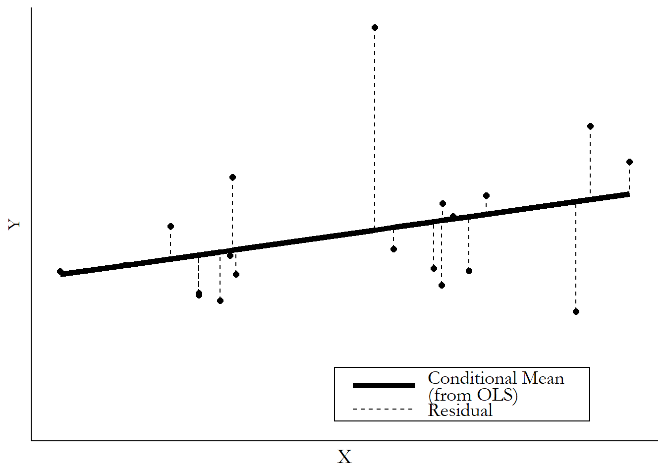
It might seem like those residuals are just little nuisances or failures, the parts we couldn’t predict. But it turns out there’s a little magic in there. Because we can also think of the residual as the part of \(Y\) that has nothing to do with \(X\). After all, if the conditional mean is \(10\) and the actual value is \(13\), then \(X\) can only be responsible for the \(10\). The extra \(3\) must be because of some other part of the data generating process.
Why would we want that? It turns out there are a number of uses for the residual. Just off the bat, perhaps we don’t just want to know the variation in vitamin E alone. Maybe what we want is to know how much variation there is in vitamin E-taking that isn’t explained by BMI. Looking at the residuals from Figure 4.7 would answer exactly that question.
Things get real interesting when we look at the residuals of two variables at once.
What if we take the explained part out of two different variables? Let’s expand our analysis to include a third variable. Let’s keep it simple with \(Y\), \(X\), and \(Z\). So, what do we do?75 This particular set of calculations, when applied to linear regression, is known as the Frisch-Waugh-Lovell theorem and doesn’t apply precisely to regression approaches that are nonlinear in parameters, like logit or probit as previously described. However, for those regressions the concept is still the same.
- Get the mean of \(Y\) conditional on \(Z\).
- Subtract out that conditional mean to get the residual of \(Y\). Call this \(Y^R\).
- Get the mean of \(X\) conditional on \(Z\).
- Subtract out that conditional mean to get the residual of \(X\). Call this \(X^R\).
- Describe the relationship between \(Y^R\) and \(X^R\).
Now, since \(Y^R\) and \(X^R\) have had the parts of \(Y\) and \(X\) that can be explained with \(Z\) removed, the relationship we see between \(Y^R\) and \(X^R\) is the part of the relationship between \(Y\) and \(X\) that is not explained by \(Z\).
In other words, we’re getting the Mean of \(Y\) conditional on \(X\) all conditional on \(Z\). We’re washing out the part of the \(X\)/\(Y\) relationship that is explained by \(Z\).
Controlling for a variable. Removing all the variation associated with that variable from all the other variables.
In doing this, we are taking out all the variation related to \(Z\), in effect not allowing \(Z\) to vary. This is why we call this process “controlling for” \(Z\) (although “adjusting for” \(Z\) might be a little more accurate).
Let’s take our ice cream and shorts example. We see that days where more people eat ice cream also tend to be days where more people wear shorts. But we also know that the temperature outside affects both of these things.
If we really want to know if ice cream-eating affects shorts-wearing, we would want to know how much of a relationship is there between ice cream and shorts that isn’t explained by temperature? So we would get the mean of ice cream conditional on temperature, and then take the residual, getting only the variation in ice cream that has nothing to do with temperature. Then we would take the mean of shorts-wearing conditional on temperature, and take the residual, getting only the variation in shorts-wearing that has nothing to do with temperature. Finally, we get the mean of the shorts-wearing residual conditional on the ice cream residual. If the shorts mean doesn’t change much conditional on different values of ice cream eating, then the entire relationship was just explained by heat! If there’s still a strong relationship there, maybe we do have something.
The easiest way to take conditional conditional means is with regression. Regression allows us to control for a variable by simply adding it to the equation. Now we have “multivariable” regression. So instead of
we just use
and voila, the OLS estimate for \(\beta_1\) will automatically go through the steps of removing the conditional means and analyzing the relationship between \(Y^R\) and \(X^R\).
Even better, we can do things conditional on more than one variable. So we could add \(W\) and do…
and now the \(\beta_1\) that OLS picks will give us the relationship between \(Y\) and \(X\) conditional on both \(Z\) and \(W\).
Let’s take a quick look at how this might affect our vitamin E/BMI relationship. Some variables that might be related to both taking vitamin E and to BMI are gender and age. So let’s add those two variables to our regression and see what we get.
Before, with only BMI, we estimated
Now, with BMI, gender, and age, we get
The effect of BMI has changed a bit, from .002 to .001, telling us that some of the relationship we saw between BMI and vitamin E was explained by age and/or gender. We also see that older people are more likely to take vitamin E - for each additional year of age we expect the proportion taking vitamin E to go up by .2 percentage points. Women are also more likely than men to take the supplement. A one-unit increase in “Female” (i.e., going from 0 - a man - to 1 - a woman) is associated with an increased proportion taking vitamin E of 1.6 percentage points.76 Of course, OLS by itself doesn’t know which variable is the treatment. So the Age effect “controls for” BMI and Female, and the Female effect controls for BMI and Age. However, we don’t want to get too wrapped up in interpreting the coefficients on controls, as we generally haven’t put much work into identifying their effects (see Chapter 5).
So how does regression do this? Put your mental-visualization glasses on.
One way to understand it is mathematically. If you happen to know a little linear algebra (and if you don’t, you can skip straight to the next paragraph), the formula for multivariate OLS is \((A'A)^{-1}A'Y\), where \(A\) is a matrix of all the variables other than \(Y\), including the \(X\) we’re interested in. In other words, it washes out the influence of all the non-\(X\) variables on the \(X/Y\) relationship by dividing out a bunch of covariances.
Another way to understand it is graphically. If you can think of a two-variable OLS line \(Y = \beta_0+ \beta_1X\) as being a line, you can think of a three-variable OLS line as a plane in 3-D space (or with four variables, in 4-D space, and so on). We can visualize this by looking at each of the three sides of that 3-D image one at a time.
Figure 4.10 shows the \(X\)-\(Y\) axis on the top-left. Then to the right you can see the \(Z\)-\(Y\) axis, and below the \(Z\)-\(X\) axis. The coordinates are flipped on the \(Z\)-\(X\) axis - even though we’re getting the mean of \(X\) conditional on \(Z\) here, I’ve put \(X\) on the \(x\)-axis to be consistent with the \(X\)-\(Y\) graph. The upward slope on the \(Z\)-\(Y\) and \(Z\)-\(X\) axes shows that \(Z\) is explaining part of both \(X\) and \(Y\), and that we could take that explanation out to focus on the residuals.
Figure 4.10: A Three-Variable Regression from All Three Dimensions
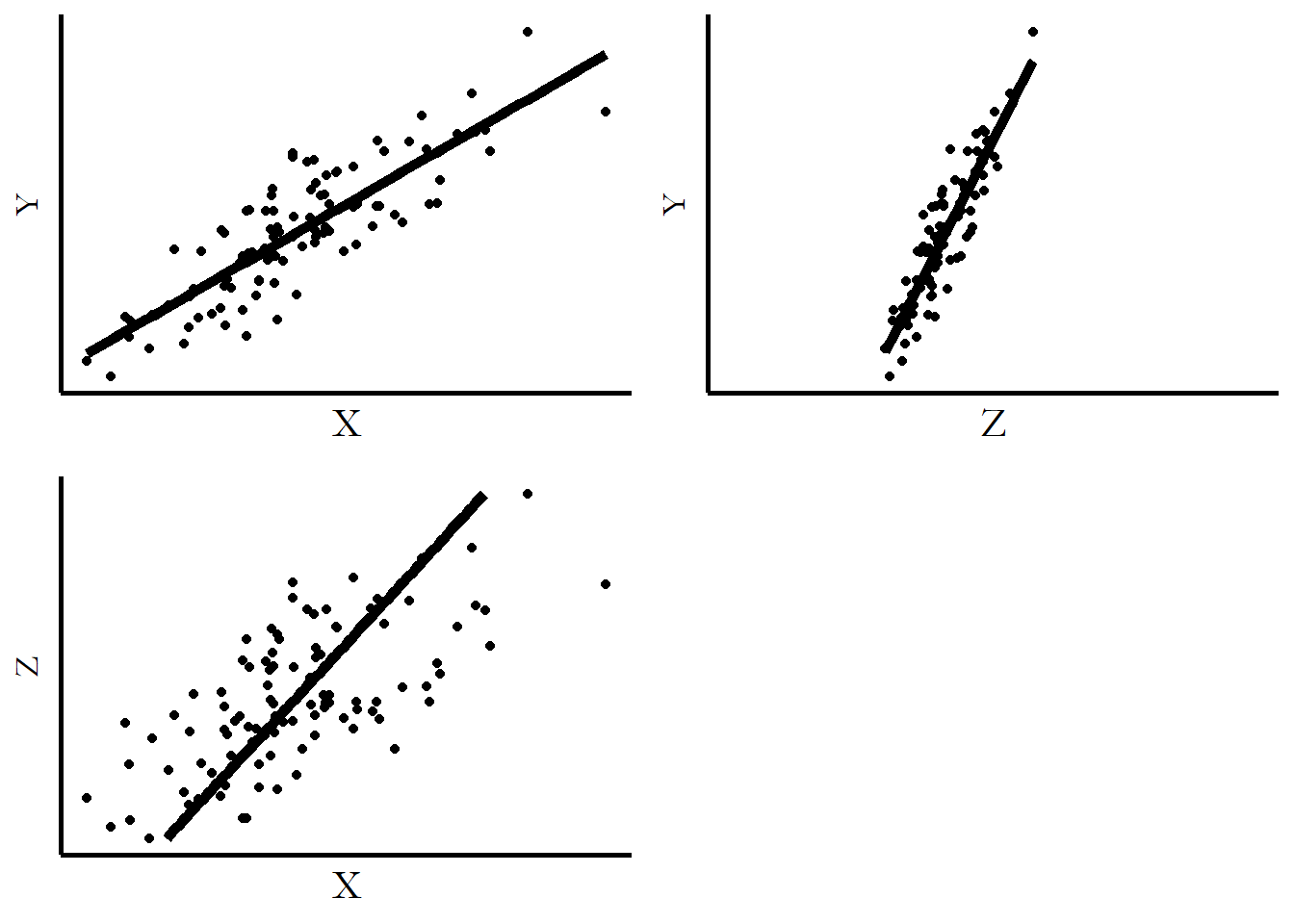
Figure 4.11: DA Three-Variable Regression from All Three Dimensions After Removing the Variation Explained by \(Z\)
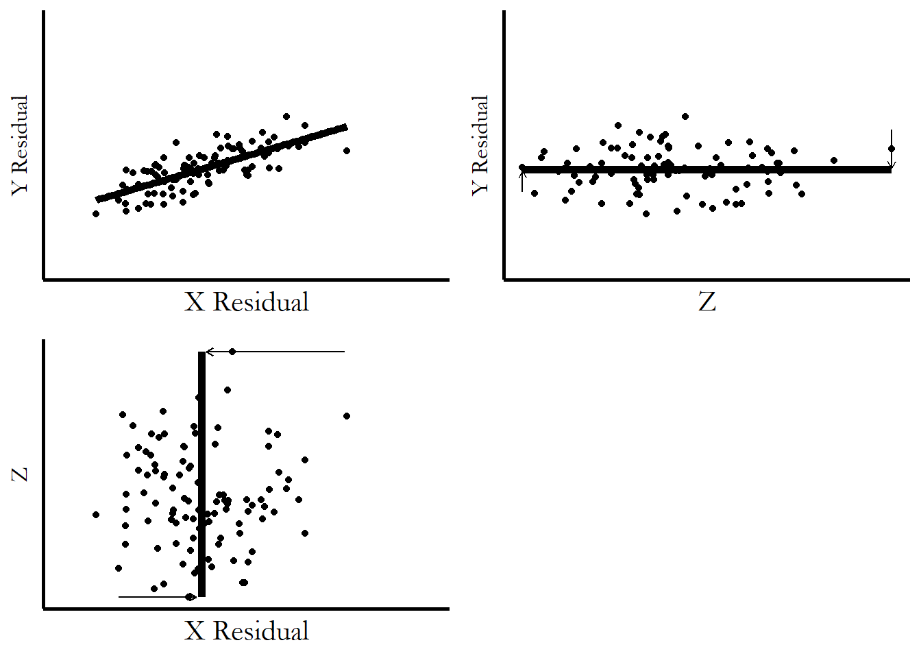
Then, in Figure 4.11, we flatten out those explanations. The upward slopes get flattened out, moving the \(X\) and \(Y\) points with them. You can see how subtracting out the parts explained by \(Z\) literally leaves the \(X\)/\(Y\) relationship no part of \(Z\) to hold on to! \(Z\) has been flatlined in both directions, providing no additional “lift” to the points in the \(X\)/\(Y\) graph. What’s still there on \(X\)/\(Y\) is there without \(Z\).
4.6 What We’re Not Covering
In the previous chapter, on describing variables, we did a pretty good job covering a lot of what you’d want to know when describing a variable. This chapter, however, leaves out a whole lot more.
This is largely for reasons of focus. This book is about research design. Once you’ve got research design pinned down, there are certainly a lot of statistical issues you need to deal with at that point. But things like specific probability distributions (normal vs. log-normal vs. t vs. Poisson vs. a million others we didn’t cover), functional form (OLS vs. probit/logit vs. many others), or standard errors and hypothesis testing can be a distraction when thinking about the broad strokes of how you’re going to answer your research question.
In one case, omission is less for focus and more to cover it more appropriately later. Notice how I introduced the Oster paper as being all about how the relationship between vitamin E and health indicators changed over time… but then I never showed how the BMI relationship changed over time? There are a number of research designs that have to do with how a relationship changes in different settings.77 Controlling for time would not achieve this. Controlling for time would remove the part of the relationship explained by time, but would not show how the relationship changes over time. However, a proper treatment of this will have to wait until Part II of the book.
To be clear, you want to know all this stuff. And I will cover it more in this book in Chapter 13, and many of the other Part II chapters. You can also check out a more traditional econometrics book like Real Econometrics (Bailey 2019Bailey, Michael A. 2019. Real Econometrics. Oxford University Press.) or Introductory Econometrics (Wooldridge 2016Wooldridge, Jeffrey M. 2016. Introductory Econometrics: A Modern Approach. Nelson Education.). But for observational data, most of the time these are things to consider after you have your design and plan to take that design to actual data.
For now, I want you to think about what you want to do with your data - what kinds of descriptions of variables your research design requires, what kinds of relationships, what kinds of conditional means and conditional conditional means. Figure out how you want your data to move, and where the relevant variation is. Figure out the journey you’re going to take first; you can pack your bags when it’s actually time to leave.
4.7 Relationships in Software
In this section, I’ll show you how to calculate or graph the relationship between variables in three different languages: R, Stata, and Python.
These code chunks may rely on packages that you have to install. Anywhere you see library(X) or X:: in R or import X or from X import in Python, that’s a package X that will need to be installed if it isn’t already installed. You can do this with install.packages('X') in R, or using a package manager like pip or conda in Python. In Stata, packages don’t need to be loaded each time they’re used like in R or Python, so I’ll always specify in the code example if there’s a package that might need to be installed. In all three languages, you only have to install each package once, and then you can load it and use it as many times as you want.
The data sets for all the examples in this book can be found in the causaldata package, which I’ve made available for all three languages. Do install.packages('causaldata') in R, ssc install causaldata in Stata, or pip install causaldata (if using pip) in Python.
So let’s do those code examples! The Oster data, while free to download, would require special permissions to redistribute. Instead, I will be using data from Mroz (1987Mroz, Thomas A. 1987. “The Sensitivity of an Empirical Model of Married Women’s Hours of Work to Economic and Statistical Assumptions.” Econometrica 55 (4): 765–99.), which is a data set of women’s labor force participation and earnings from 1975.
In each of these languages, I’m going to:
- Load in the data
- Draw a scatterplot between log women’s earnings and log other earnings in the household,78 Why am I using the log of earnings for most of these steps? Think carefully about what we learned about logarithms in Chapter 3. among women who work
- Get the conditional mean of women’s earnings by whether they attended college
- Get the conditional mean of women’s earnings by different bins of other household earnings
- Draw the LOESS and linear regression curves of the mean of log women’s earnings conditional on the log amount of other earnings in the household
- Run a linear regression of log women’s earnings on log other earnings in the household, by itself and including controls for college attendance and the number of children under five in the household
R Code
library(tidyverse); library(modelsummary)

df <- causaldata::Mroz %>%
    # Keep just working women
    dplyr::filter(lfp == TRUE) %>%
    # Get unlogged earnings
    mutate(earn = exp(lwg))

# 1. Draw a scatterplot
ggplot(df, aes(x = inc, y = earn)) +
    geom_point() +
    # Use a log scale for both axes
    # We'll get warnings as it drops the 0s, that's ok
    scale_x_log10() + scale_y_log10()

# 2. Get the conditional mean by college attendance
df %>%
    # wc is the college variable
    group_by(wc) %>%
    # Functions besides mean could be used here to get other conditionals
    summarize(earn = mean(earn))

# 3. Get the conditional mean by bins
df %>%
    # use cut() to cut the variable into 10 bins
    mutate(inc_cut = cut(inc, 10)) %>%
    group_by(inc_cut) %>%
    summarize(earn = mean(earn))

# 4. Draw the LOESS and linear regression curves
ggplot(df, aes(x = inc, y = earn)) +
    geom_point() +
    # geom_smooth by default draws a LOESS; we don't want standard errors
    geom_smooth(se = FALSE) +
    scale_x_log10() + scale_y_log10()
# Linear regression needs a 'lm' method
ggplot(df, aes(x = inc, y = earn)) +
    geom_point() +
    geom_smooth(method = 'lm', se = FALSE) +
    scale_x_log10() + scale_y_log10()

# 5. Run a linear regression, by itself and including controls
model1 <- lm(lwg ~ log(inc), data = df)
# k5 is number of kids under 5 in the house
model2 <- lm(lwg ~ log(inc) + wc + k5, data = df)
# And make a nice table
msummary(list(model1, model2))
Stata Code
* Don't forget to install causaldata with ssc install causaldata
* if you haven't yet.
causaldata Mroz.dta, use clear download
* Keep just working women
keep if lfp == 1
* Get unlogged earnings
g earn = exp(lwg)
* Drop negative other earnings
drop if inc < 0

* 1. Draw a scatterplot
twoway scatter inc earn, yscale(log) xscale(log)

* 2. Get the conditional mean college attendance
* Note the syntax is different in older versions of Stata, see help table
table wc, stat(mean earn)

* 3. Get the conditional mean by bins
* Create the cut variable with ten groupings
egen inc_cut = cut(inc), group(10) label
table inc_cut, stat(mean earn)

* 4. Draw the LOESS and linear regression curves
* Create the logs manually for the fitted lines
g loginc = log(inc)
twoway scatter loginc lwg || lowess loginc lwg
twoway scatter loginc lwg || lfit loginc lwg

* 5. Run a linear regression, by itself and including controls
reg lwg loginc
reg lwg loginc wc k5
Python Code
import pandas as pd
import numpy as np
import statsmodels.formula.api as smf
import seaborn as sns
import seaborn.objects as so
from causaldata import Mroz

# Read in data
dt = Mroz.load_pandas().data
# Keep just working women
dt = dt.query('lfp == True')
# Create unlogged earnings
dt = dt.assign(earn = lambda x: np.exp(x['lwg']))

# 1. Draw a scatterplot
(so.Plot(dt, x = 'inc', y = 'earn')
.add(so.Dot()).scale(x = 'log', y = 'log'))

# 2. Get the conditional mean by college attendance
# wc is the college variable
dt.groupby('wc').agg({'earn': 'mean'})

# 3. Get the conditional mean by bins
# Use cut to get 10 bins
dt = dt.assign(inc_bin = lambda x: pd.cut(x['inc'],10))
dt.groupby('inc_bin').agg({'earn': 'mean'})

# 4. Draw the LOESS and linear regression curves
# Do log beforehand for these axes
dt = dt.assign(linc = lambda x: np.log(x['inc']))
sns.regplot(x = 'linc', y = 'lwg',
            data = dt, lowess = True, ci = None)

# 5. Run a linear regression, by itself and including controls
m1 = smf.ols(formula = 'lwg ~ linc', data = dt).fit()
print(m1.summary())
# k5 is number of kids under 5 in the house
m2 = smf.ols(formula = 'lwg ~ linc + wc + k5', data = dt).fit()
print(m2.summary())Page built: 2025-10-17 using R version 4.5.0 (2025-04-11 ucrt)